Logo Design
- Home
- Graphics Design
- Logo Design

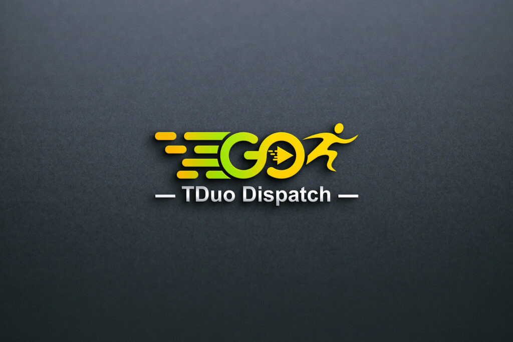
GO Dispatch, a dynamic and forward-thinking logistics company, approached us to create a unique logo that would embody their core values of reliability, efficiency, and innovation in transportation and delivery services. The objective was to design a visual identity that not only resonates with their brand ethos but also stands out in the competitive logistics and dispatch industry.
Design Objectives:
- Create a logo that visually communicates speed, trustworthiness, and professionalism.
- Incorporate design elements that reflect movement and connectivity, aligning with the nature of the dispatch and logistics industry.
- Ensure the logo is versatile and adaptable for various mediums, including digital platforms, business cards, vehicle branding, and uniforms.
- Develop a timeless and modern aesthetic that aligns with GO Dispatch’s long-term brand vision.
Design Process:
- Research and Discovery:
- Conducted an in-depth consultation with the client to understand their business model, target audience, and branding preferences.
- Analyzed competitors in the logistics industry to identify key trends and opportunities for differentiation.
- Concept Development:
- Explored multiple design concepts focusing on key themes like motion, precision, and trust.
- Experimented with various design elements, including arrows, road motifs, and abstract symbols representing movement.
- Typography and Color Selection:
- Selected bold and modern typography to convey strength and professionalism.
- Chose a color palette that combines energetic and reliable tones, such as blue (trust and stability) and orange (energy and innovation).
- Final Design:
- Delivered a sleek and modern logo that features a dynamic arrow motif seamlessly integrated into the typography.
- The arrow symbolizes speed and direction, while the clean lines and bold font exude confidence and reliability.
- The color palette enhances the brand’s visibility and conveys a sense of trust and energy.
